Design
Designing for the Fold: What the iPhone Duo Means for Your App’s UI
Summary
Apple’s iPhone Duo, launched September 9, 2026, introduces a 7.6-inch foldable display, bringing major changes for app designers and developers. This blog covers Apple’s design guidelines, key development practices, and how Q3 Technologies helps businesses optimize apps for next-gen digital experiences.
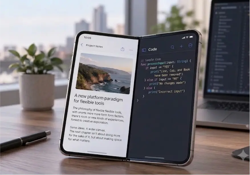
On September 9, 2026, Apple introduced the iPhone Duo at its “Surprise and Shine” event in Cupertino — a titanium, book-style foldable with a 5.4-inch outer display and a 7.6-inch inner OLED display, an IP68 rating, Ceramic Shield 2 glass, and a starting price of $1,999. Preorders opened October 16, with the device shipping October 23. This was never going to be a niche accessory. IDC projects Apple will capture more than 22%-unit share and roughly a third of foldable-market value in its very first year, and Counterpoint Research expects global foldable smartphone shipments to pass 100 million cumulative units by the end of 2026. Put plainly: millions of people are about to own a phone that changes shape, and your app’s iPhone Duo UI design is what decides whether that moment feels magical or broken.
How Does Folding Actually Change the Way People Hold and Use Your App?
When our design team at Q3 Technologies got hands-on time with early iPhone Duo builds, the first thing we noticed wasn’t the size of the inner screen — it was how many different ways people actually hold the device. Closed, it sits in a pocket like any other iPhone and gets used one-handed, thumb doing all the work. Opened flat, it becomes a small tablet with room for two columns of content. Propped up like a tiny laptop on a desk or nightstand, it turns into a stand for video calls or a bedside clock. Apple calls these “poses” — book, table, and standing — and its own guidance is blunt about it: a well-built app should already adapt to the iPhone Duo, and it will look broken if it wasn’t built that way. That’s the real story of foldable iPhone UI and modern mobile app development: it isn’t one new screen size, it’s four or five contexts your app now has to survive.
What Does Apple’s Own Guidance Say About UI Design for Foldable iPhone?
- Two size classes, not one device: Apple wants layouts built from compact and regular size classes, layout margins, and safe-area insets — not pixel dimensions tied to a single model. A layout built this way should already flex correctly across poses.
- Bars move to the side: On the outer display, and on the inner display in landscape, tab bars, toolbars, and back controls shift from the top or bottom of the screen to the right edge, to maximize vertical space and stay within easy thumb reach.
- Three reserved zones: Every layout has to respect the Dynamic Island, the camera housing, and the fold line itself — content and controls cannot be trapped or clipped by any of the three.
- Arrangements, not custom code: Apple’s new layout container turns a horizontal or vertical stack into a “split” and a layered view into an “overlay” automatically, so scrolling content like feeds, articles, and documents stays put at the fold instead of jumping around.
- Split View awareness: When your app sits in Split View next to another app, its own controls should move to the edge of its pane, not the edge of the whole device.
Is Your App’s Fixed UI Ready for the Foldable Era?
Let our experts build a responsive, user-friendly experience that adapts seamlessly across screen states.
What Are the Best UI Practices for Foldable Devices You Should Adopt Right Now?
Guidelines are one thing; shipping decisions are another. Based on the compatibility audits we’ve been running on client apps since the announcement, here is what actually separates apps that feel native to a fold from ones that feel patched together. These are, in our experience, the best UI practices for foldable devices worth prioritizing this quarter:
- Design for states, not devices: Wireframe the closed, half-open, fully open, and tabletop states as separate “screens” in your design file, the same way you’d design for phone and tablet today.
- Treat the fold as a seam, never a wall: Content that scrolls — feeds, chat threads, long documents — should flow across the fold untouched. Only interactive elements like alerts, action sheets, and toolbars should reposition around it.
- Keep primary actions in thumb range: With controls migrating to the side rail, re-check every “top left” or “top right” action and ask whether a one-handed thumb can still reach it on the outer display.
- Audit before you redesign: Most existing apps don’t need a rebuild; they need a compatibility pass to find hardcoded widths, fixed navigation bars, and assumptions baked in years ago.
- Test every pose, not just “open”: A layout that looks perfect fully unfolded can break completely propped on a table — build that testing pass into your QA checklist from day one, not as an afterthought.
How Should App Design for Foldable Devices Start — From the First Wireframe?
The honest, if unglamorous, truth we tell every client is this: bolting fold-support onto a finished app is always more expensive than designing for it from the outset. Good app design for foldable devices starts in product discovery, not in a Figma file after the fact. That means asking, before a single screen is drawn, who the extra display space actually serves and how it can improve the user experience— is it more context for a dashboard, side-by-side content for a reading app, or a richer camera and FaceTime experience? It means mapping information architecture against both displays and every pose, not just the primary one. And it means agreeing, as a team, which features genuinely benefit from the inner display’s 7.6 inches and which ones are fine staying compact, because not every screen needs to sprawl just because it can.
Why Does Foldable Device App UI Expose Weak Design Systems So Fast?
Here’s something we’ve seen firsthand: the iPhone Duo doesn’t just test your layouts; it tests your entire design system. Apps built with token-based spacing, componentized navigation, and flexible grids adapted within days in our internal test builds. Apps built on fixed pixel values, hardcoded navigation bars, and one-off screen logic broke in ways their own teams hadn’t anticipated — buttons crowding the camera housing, content sliding under the Dynamic Island, forms that simply refused to reflow. That’s the uncomfortable truth about foldable device app UI: it doesn’t create new problems so much as it makes every shortcut you already took visible, all at once, to every user who unfolds their phone.
Are Clipped Content, and Poor Responsiveness Hurting Your App Experience?
We can help you redesign your app for seamless foldable experiences.
How Do You Actually Start Designing Responsive Apps for Foldable Devices?
If you’re staring at an existing app wondering where to begin, this is the sequence we walk clients through, and it holds up whether you’re preparing a fintech dashboard or a retail app for the fold. This is the practical path to designing responsive apps for foldable devices:
- Run a compatibility audit: Catalogue every fixed dimension, hardcoded breakpoint, and screen-specific assumption across your codebase and design files before you touch a single screen.
- Rebuild navigation around size classes: Move from “this app has a bottom tab bar” to “this app has a tab bar that adapts by size class and pose,” using Apple’s own arrangement patterns as the model.
- Componentize before you customize: Turn recurring UI patterns — cards, list rows, forms — into flexible components once, so every screen that uses them inherits fold support automatically.
- Prototype in Xcode’s Duo simulator: Apple’s beta tooling includes a dedicated simulator; use it early rather than waiting for physical devices to reach your QA team.
- Ship, measure, iterate: Treat the first release as a baseline — track crash reports, layout complaints, and usage by pose, then refine the next sprint around real data.
What Does Responsive UI for Foldable Devices Mean for Your Engineering Roadmap?
For engineering leads, this isn’t a design-only conversation. Building genuinely responsive UI for foldable devices touches your architecture, your QA matrix, and your release calendar. Teams using SwiftUI’s declarative layout model generally have an easier path, since size classes and safe areas are baked into the framework already; teams still on UIKit will need a deliberate audit of view controllers and Auto Layout constraints. Either way, budget for an expanded testing matrix — poses, orientations, and Split View combinations multiply your QA scenarios well beyond a standard device matrix — and plan your release timeline around Apple’s own rollout, since the full SDK, simulator, and developer preparation guidance only became fully available shortly before the device’s October 23 launch.
Is Your Existing App Losing Users on New Foldable Devices?
Let us audit, redesign, and optimize your app for responsive multi-screen experiences.
Case Study: How Q3 Technologies Redesigned a Multi-Screen Training Experience
This kind of adaptive, multi-context design work is exactly the discipline foldable devices now demand — and it’s the same discipline Q3 Technologies applied when we redesigned the UX for a healthcare professional training platform used across desktop, tablet, and mobile. The brief looked deceptively similar to a foldable challenge: one body of learning content, several very different screen contexts, and a user base that switched between them mid-task. Our UX team rebuilt the information architecture and interaction model around adaptive layouts rather than fixed screens, validated every state through usability testing, and shipped a system that held together no matter which device a clinician picked up next.
You can read the full breakdown, including the research process and outcomes, in our case study, Reimagining Healthcare Professional Training with Smart UX Innovation.
Why Choose Q3 Technologies as Your Intuitive Design Partner?
There is no shortage of agencies claiming foldable-readiness this quarter. What’s harder to find is a partner with the delivery history to back it up.
- 25+ years of enterprise design and engineering delivery, with 300+ digital products designed and shipped across healthcare, fintech, retail, and enterprise SaaS.
- Research-first process: Every layout decision is traced back to a user insight or a business goal, not a mood board, so fold-support decisions are validated, not guessed at.
- End-to-end design-to-development handoff: Our design teams sit alongside our software development and mobile engineering teams, removing the translation gap between a Figma file and a shipped iOS build.
- Accessibility and compliance by default: Every component we ship meets WCAG 2.1 AA standards, which matters even more once controls start moving between edges and poses.
- 40% faster time-to-production, thanks to a library of pre-built, research-validated UX patterns and reusable design-system foundations, so you’re not starting your foldable redesign from zero.
The Fold is Not Optional Anymore
The iPhone Duo is not a gimmick and it is not going away — it’s Apple’s clearest signal yet that the rectangle you’ve been designing for is changing shape. Teams that treat this as a UI afterthought will spend the next year fielding bug reports about clipped buttons and broken navigation. Teams that treat it as an opportunity — more room for content, richer camera and multitasking experiences, workflows that finally have space to breathe — will be the ones users choose to keep on their home screen. If you’re ready to get your app in front of the fold instead of behind it, talk to Q3 Technologies‘ design services team and let’s map out what your app’s iPhone Duo experience should look like.
FAQs
1. What is the best UI design for foldable phones?
The best UI design for foldable phones uses adaptive layouts that respond to screen size, orientation, and device posture. Designers should use flexible grids, responsive components, safe-area constraints, and size classes instead of fixed dimensions. For the iPhone Duo, the UI needs to work across its 5.4-inch outer display and 7.6-inch inner display.
2. How do you design an app for a foldable phone?
Start by mapping the user experience across different device states, including closed, partially open, fully open, and tabletop modes. Build flexible navigation and reusable components, account for the fold and camera areas, and test the interface across portrait, landscape, and Split View configurations.
3. How do you make an app responsive for foldable devices?
Use adaptive layout techniques such as size classes, flexible constraints, responsive grids, safe-area insets, and reusable UI components. Avoid hardcoded widths and positions. The interface should automatically reflow when the available screen space changes instead of requiring separate layouts for every device configuration.
4. What are the challenges of designing apps for foldable devices?
The main challenges include supporting multiple screen states, adapting navigation, handling fold and hinge areas, maintaining touch accessibility, and expanding the QA matrix. Developers may need to test 10+ meaningful layout combinations when device states, orientations, and Split View scenarios are combined.
5. What is responsive design for foldable devices?
Responsive design for foldable devices means creating an interface that adapts to screen size, orientation, device posture, and available space. Instead of designing a separate fixed screen for every configuration, developers create flexible components and layout rules that automatically adjust as the device changes.
6. Do apps need to be redesigned for foldable phones?
Not necessarily. Many existing apps can be adapted through a compatibility audit that identifies fixed widths, hardcoded navigation, rigid constraints, and non-responsive components. Teams can then update affected components and layouts without rebuilding the entire application from scratch.

Table of content
- How Does Folding Actually Change the Way People Hold and Use Your App?
- What Does Apple’s Own Guidance Say About UI Design for Foldable iPhone?
- What Are the Best UI Practices for Foldable Devices You Should Adopt Right Now?
- How Should App Design for Foldable Devices Start — From the First Wireframe?
- Why Does Foldable Device App UI Expose Weak Design Systems So Fast?
- How Do You Actually Start Designing Responsive Apps for Foldable Devices?
- What Does Responsive UI for Foldable Devices Mean for Your Engineering Roadmap?
- Case Study: How Q3 Technologies Redesigned a Multi-Screen Training Experience
- Why Choose Q3 Technologies as Your Intuitive Design Partner?
- FAQs
Related Case Studies